
SaaS Product UX Review: Reports in Freshdesk vs Zoho desk
SaaS Product UX Review: Reports in Freshdesk vs Zoho desk

Launching UX review series: In this series, we will do short UX reviews of some of the popular SaaS based enterprise softwares. We will look at some of the critical user journeys such as onboarding, report generation flow, adding your team flow etc, from a user experience point of view.
Special thanks to my friend and fellow designer Dharmesh Ba for his inputs on what user flows might be of reader’s interest. Check out his youtube channel India notes.
UX review: Report feature
Today we are going to look at report journey in two popular help-desk softwares, namely Freshdesk from Freshworks and ZohoDesk from Zoho.
Both of these softwares are poster-children of Indian SaaS ecosystem which is gaining massive global acceptance. Both of them are help-desk platforms. If you are new to help-desk softwares, in simplified terms, it is a sophisticated email handling tool for customer support teams. Incoming customer enquiries are called tickets and they get assigned to one of the support staff to be resolved in a finite time period. With brands embracing social marketing and omni-channel commerce, help-desk tools are increasingly transforming into hybrid platforms that can handle social media comments, voice calls and also store customer information like CRMs. With this background, let’s jump right in.
Meet dashboards, the tip of the reports iceberg
Not just for help-desks but for almost all enterprise softwares, the landing page is typically a dashboard of some sort. Both freshdesk and zoho desk starts with a dashboard.
Freshdesk shows a demo dashboard with actual numbers that paints a picture of a typical work day, for the first time users.
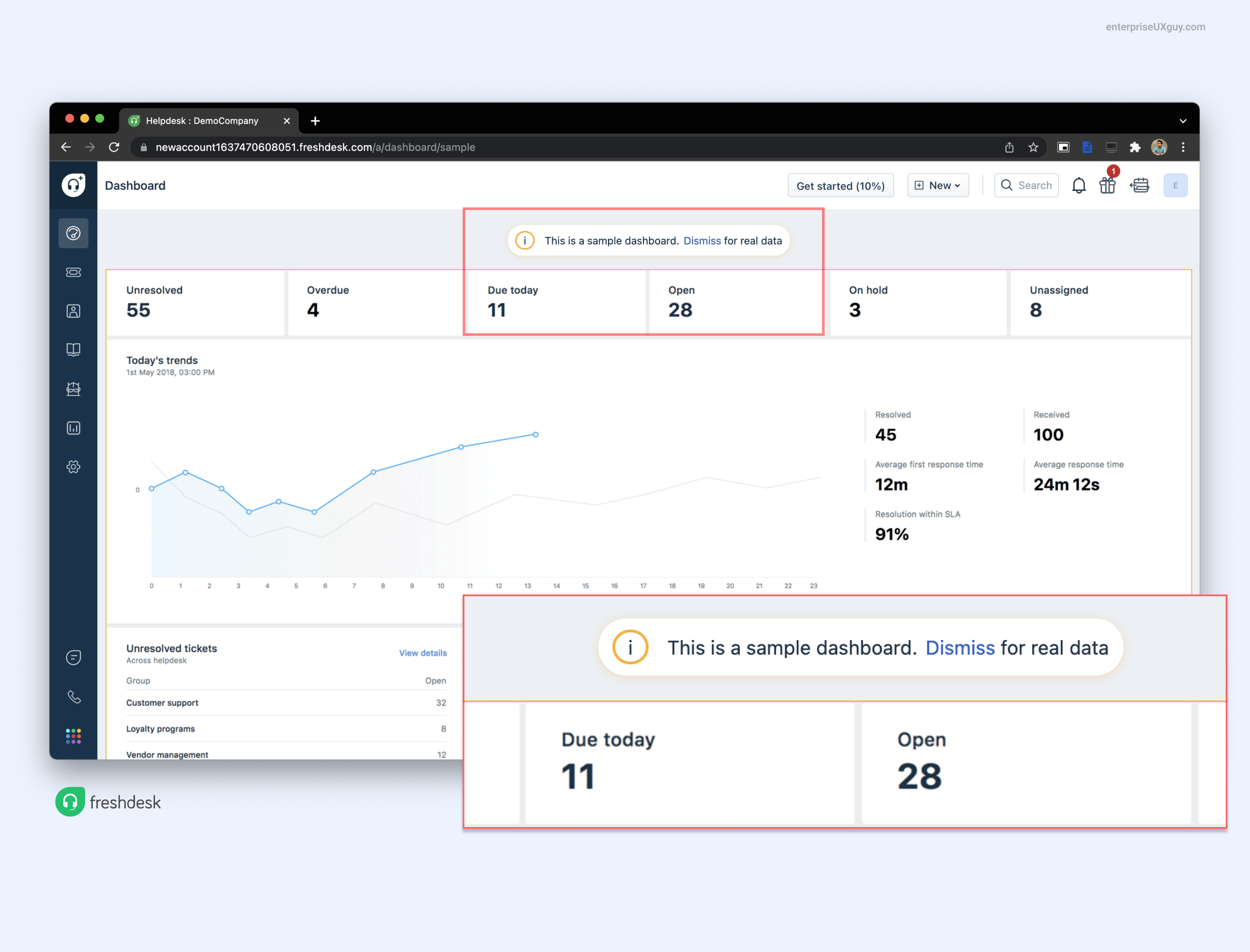
So instead of seeing all zeros in the real charts when you start, you see an image of a fully populated dashboard with a message that clarifies that this is only a demo dashboard. This is a clever and thoughtful user experience feature.
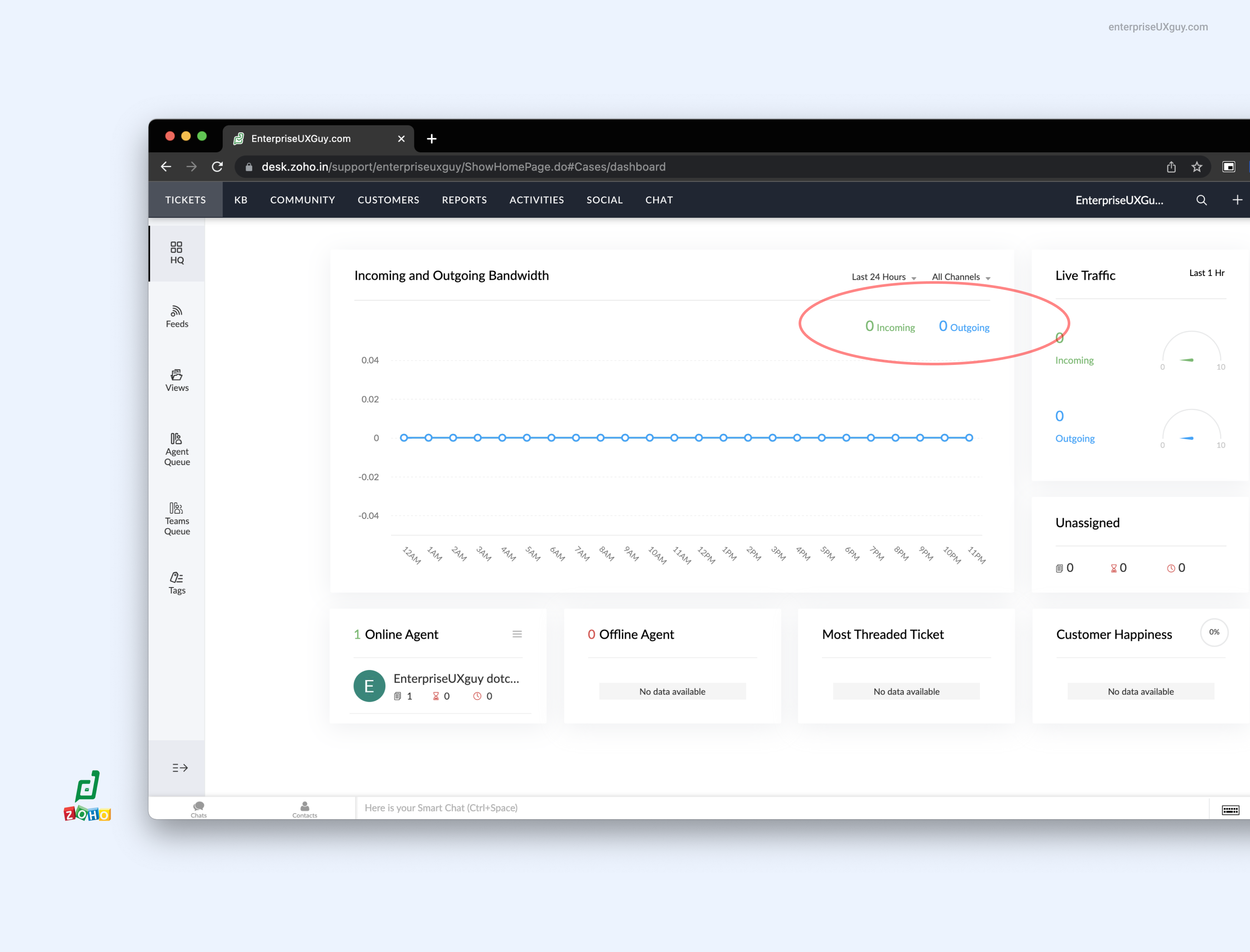
Zoho desk on the other hand shows a standard dashboard filled with zeros. Nothing wrong with it, but i like the user thought behind freshdesk's version.
Don't make me think, at least when it comes to navigation
Steve Krug's 'Don't make the users think' resonates with me in most cases. But in real world complex SaaS softwares, applying that principle in isolation is very tricky.
So instead of making every page intuitively simple, the practical mid point is to make key aspects such as 'navigation' to be outrightly intuitive and simple. And to some extent both freshdesk and zoho desk fell short.
Some observations:
In both softwares, you see collapsed side navigation as default view. This makes it difficult to glance at the menu items to get a sense of it.
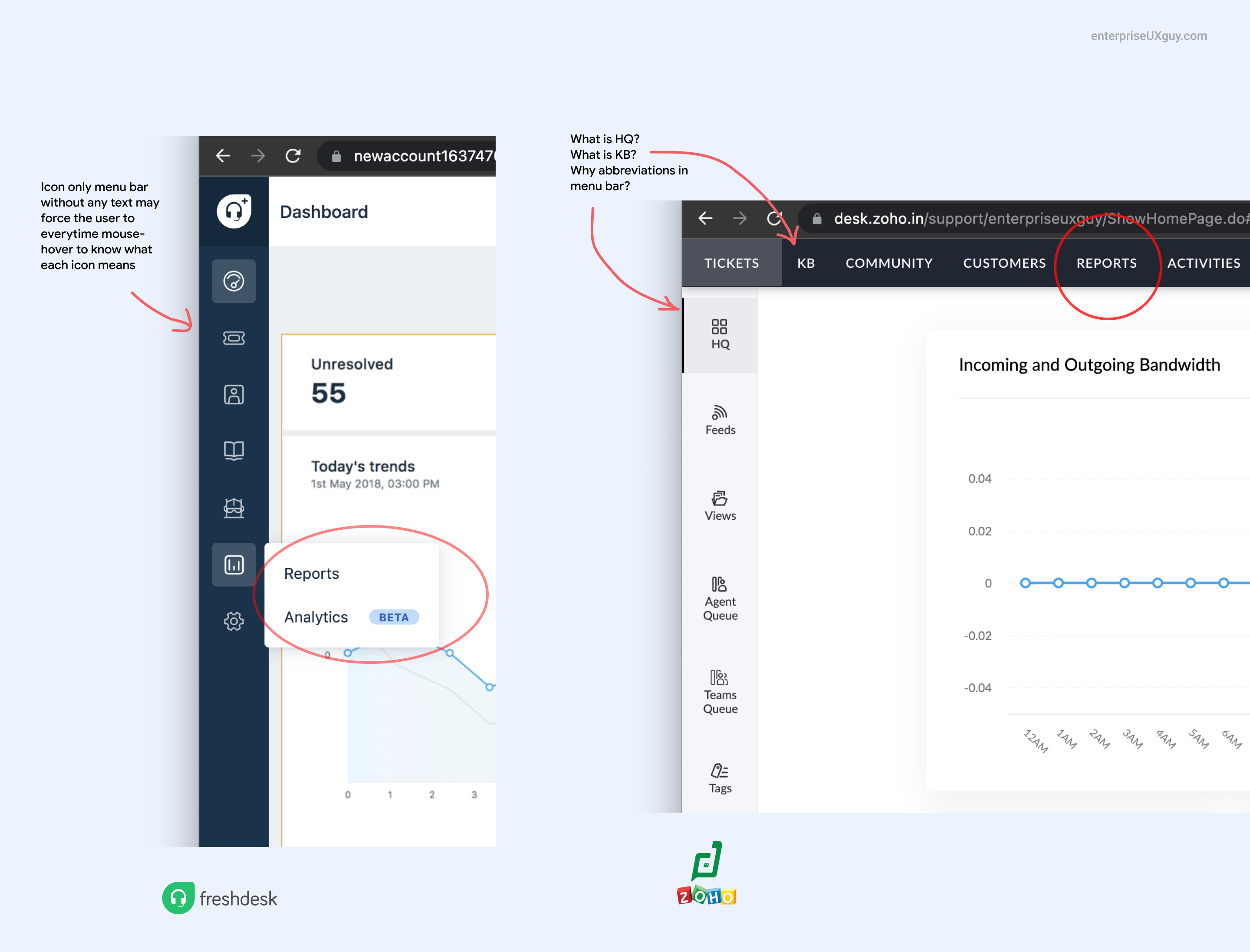
Zoho has custom acronyms in their navigation menu. What does HQ mean? I am used to seeing 'Home' or 'Overview' as the first item in the navigation bar. And the icon is not helping me either. Then comes KB. Some items are written in full form and some are abbreviated. I couldn't see any rationale in the first glance. Why make me guess when it should have been simple and straightforward in the first place?
Freshdesk menu is also a collapses one without text explaining what each one is. One easier solution is to show them expanded by default and allow the user to collapse it if needed.
Maintain consistency in layout - basics of Usability 101
In Zoho desk, when i click on reports from the top navigation bar, it loads a new page in which the left navigation menu is not present. It loads a different navigation menu with different set of items.
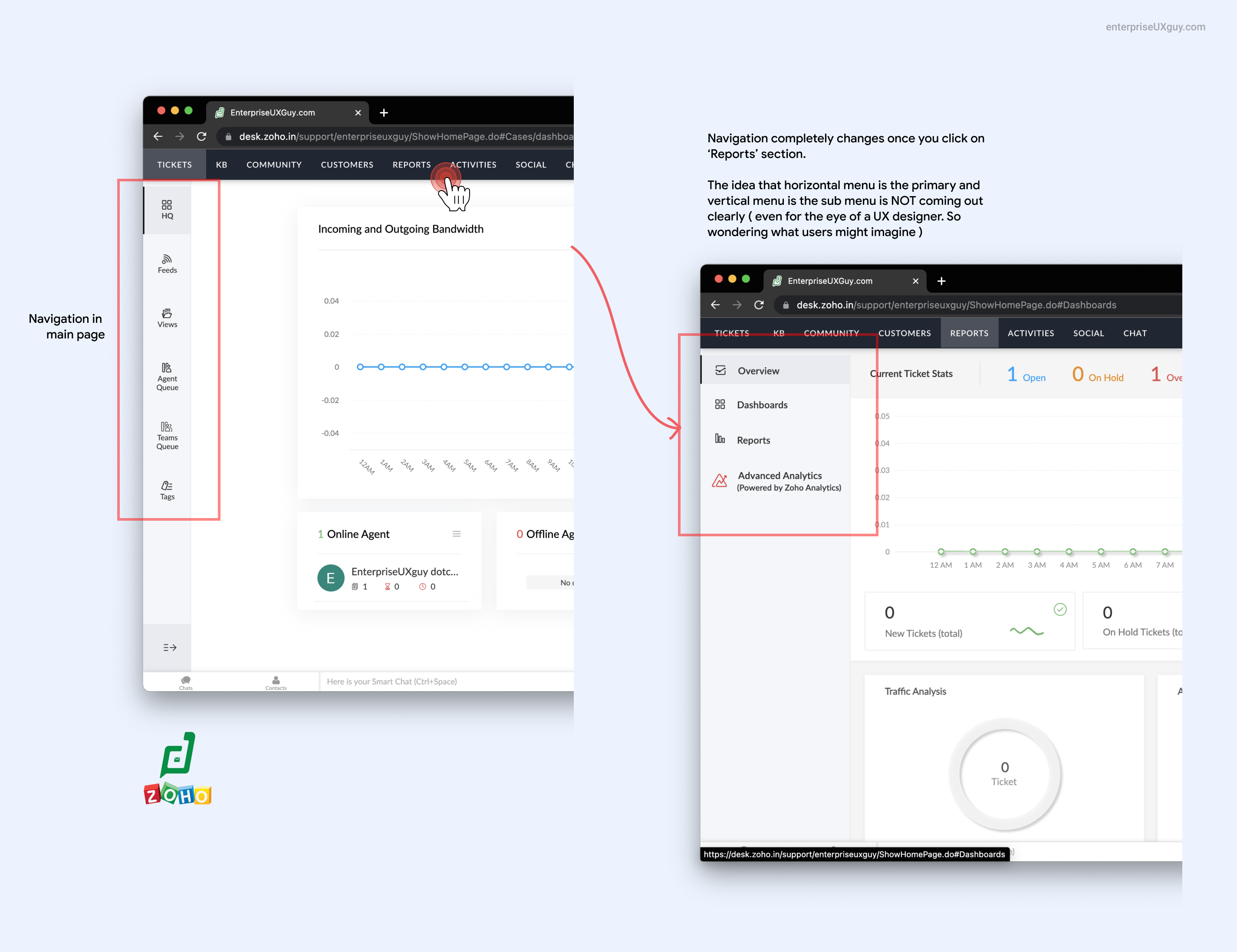
Consistency in layouts helps the user establish a mental model of the software and how to navigate it.
It is same as how we humans make a mental model of a mall that you visit for the first time. For example…
All escalators are placed one above the other.
Shops are in different levels.
There is signage to tell you which floor you are in now and how to reach other floors.
All this is valuable information to make a mental model of that physical space. Same is applicable for a software and even more so since it is limited by your computer screen and you can see only one screen at a time.
So UX principle here is to insist on consistency and have a rationale for that consistency. ( aka information architecture in UX parlance )
Enable quick choice making...
Once you land on the reports menu, you see a long list of text menu in Zoho desk. The visual design for some strange reason doesn't seem to be emphasising on the section headings of each groups. Instead the emphasis is on the table header (which is anyway same across all sections)
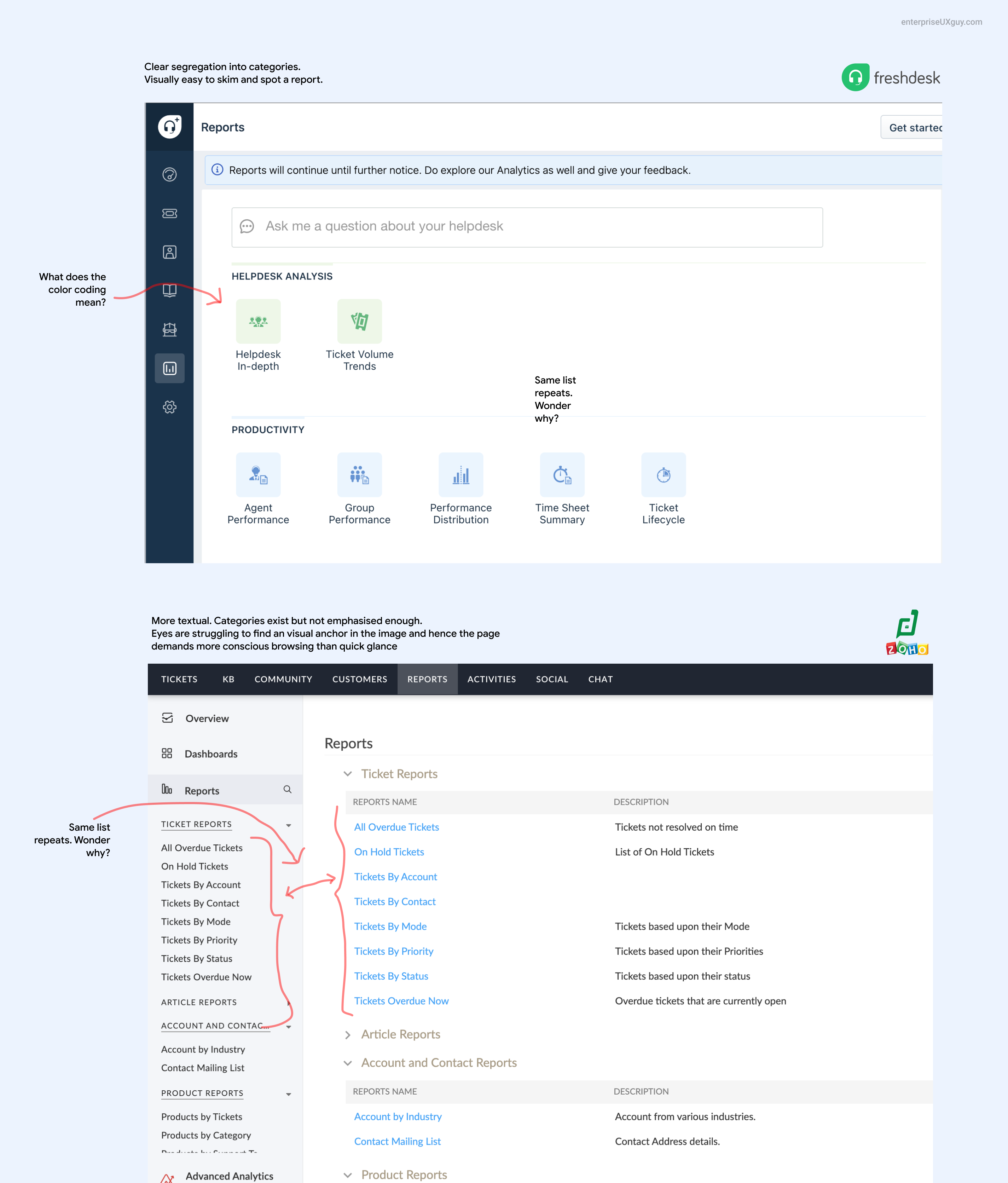
Whereas in Freshdesk,
you see well spaced out icons separated into its own categories.
It is far more readable, easy to scan and eventually develop a muscle memory for quickly picking a report item.
Although i did not understand the reason behind color coding each section differently. Are these colors consistent across the software (if so, that will be great ) or is it just a styling element in this page ( then ... they can very well do with a single color icons )
Smart search in Freshdesk
The one feature that stood out for me was the smart search at the top of the page in freshdesk. When you have a long list of items ( more than 7 as per many UI studies) to choose from, give an option to search for the items quickly with a search bar.
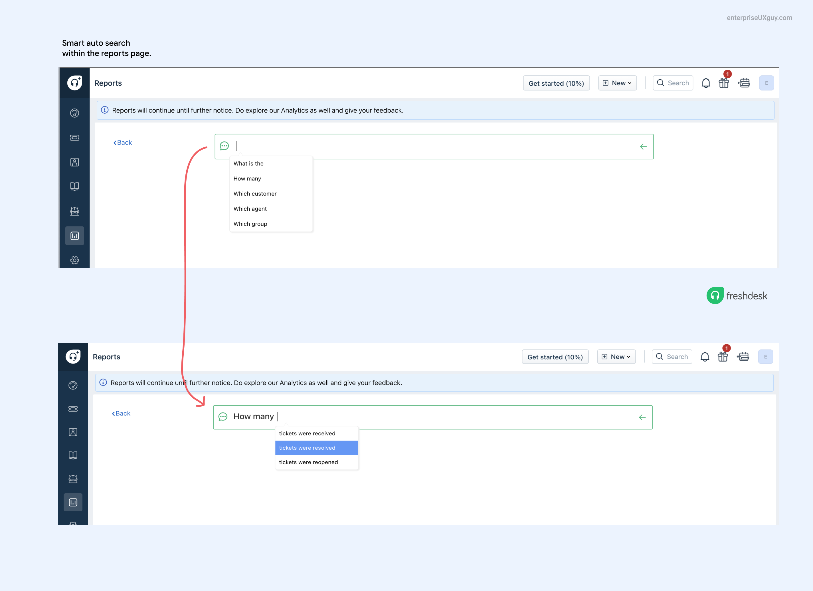
Freshdesk has gone one step further here and made the search super smart and suggestive. It gives you meaningful suggestions on typical search cases that you will ask for. that is smart.
Once you are in the actual report page- what UX flows are important ?
Let's say you land on the particular report that you want to look into, what features should i build to make my UX better? I am going to consciously stay away from discussing the correct metrics and its visualisations. To meaningfully do that, i need more understanding of the user persona and the business use case. Instead we will look at key customer experiences that you can build here.
Reports are meant for SHARING !
Reports typically exist for someone to share it to someone in the organisation to make some analysis. Alright i have used lot of 'some's in that 😂
So make it super easy for someone to share a report. Best way is to send a quick link to that particular view and the recipient can click and see exactly what you are seeing. In some cases, the report will have data only for a limited period of time (like 7 days or 30 days based on pricing tier). So there you may need a permanent storage of that report view. So allow options to export the entire report as PDF.

Both zoho and freshdesk allows for that but freshdesk has a much easier one click PDF export, which is nice.
Provide proactive guides or help articles
Don't take your user to be dumb. At the same time, don't assume that they know everything. Reporting is a technical feature. And it is common that some of the graphs or metrics may be new or unclear to your users. So take that extra step and proactively tell them what each one of them is about.
Freshdesk has this nifty link on the top of the page which says "how to use this report"
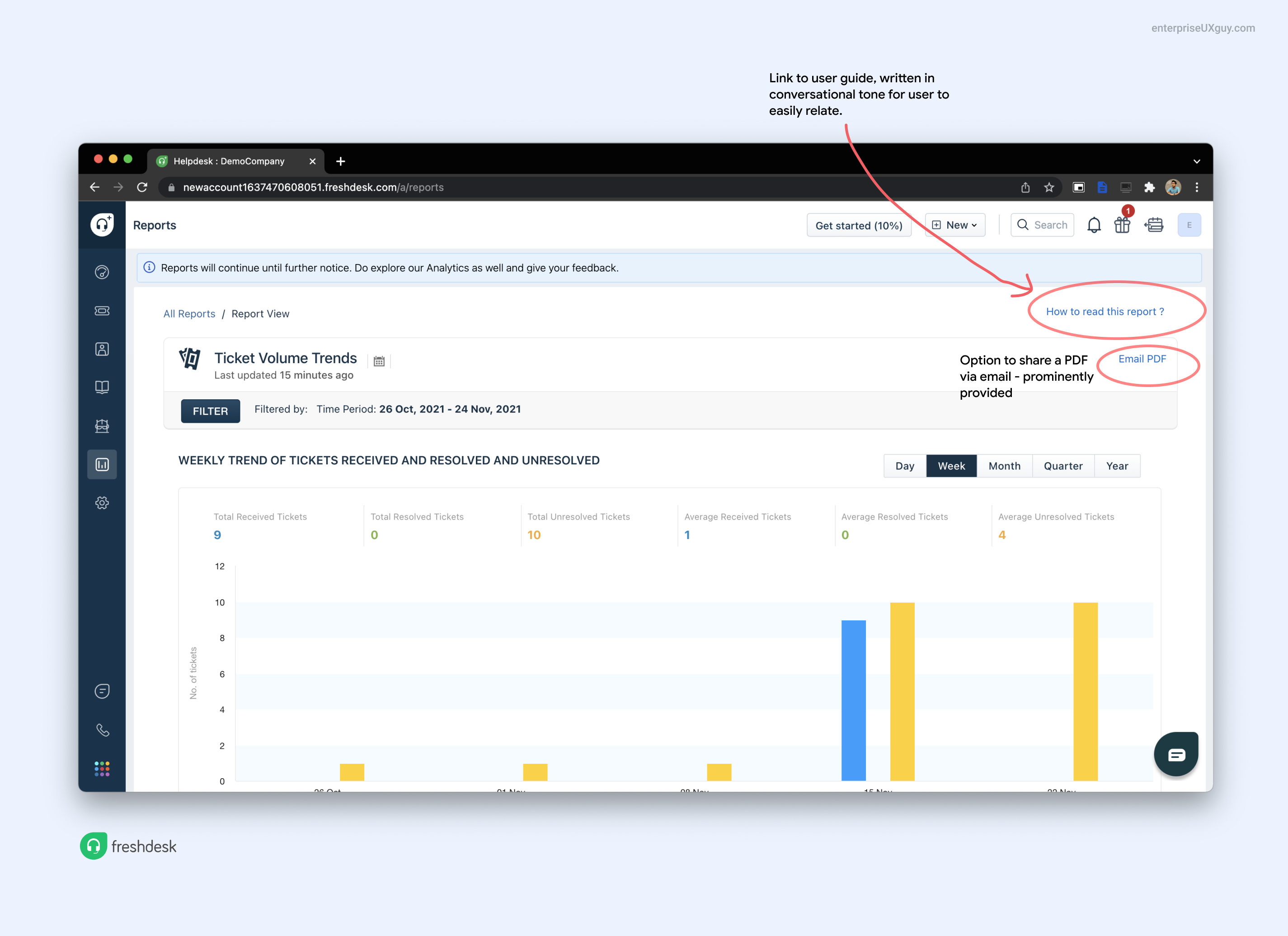
This is brilliant UX approach particularly because of the 'conversational' tone of the words. It is not saying help doc -which sounds super serious and boring or blog- which sounds super casual or extra information. Instead this phrase captures the intent beautifully. I would love to see how many people landing on this page actually click on that link.
In zoho, such user centric features are terribly missing. And particularly when the list is so long in zoho, i would expect some kind of user guidance to help in the user experience.
Make it easy to compare and correlate
Use colors, spacing and arrangement to help in making comparisons easier for your user. In this case both zoho desk and freshdesk can improve a lot.
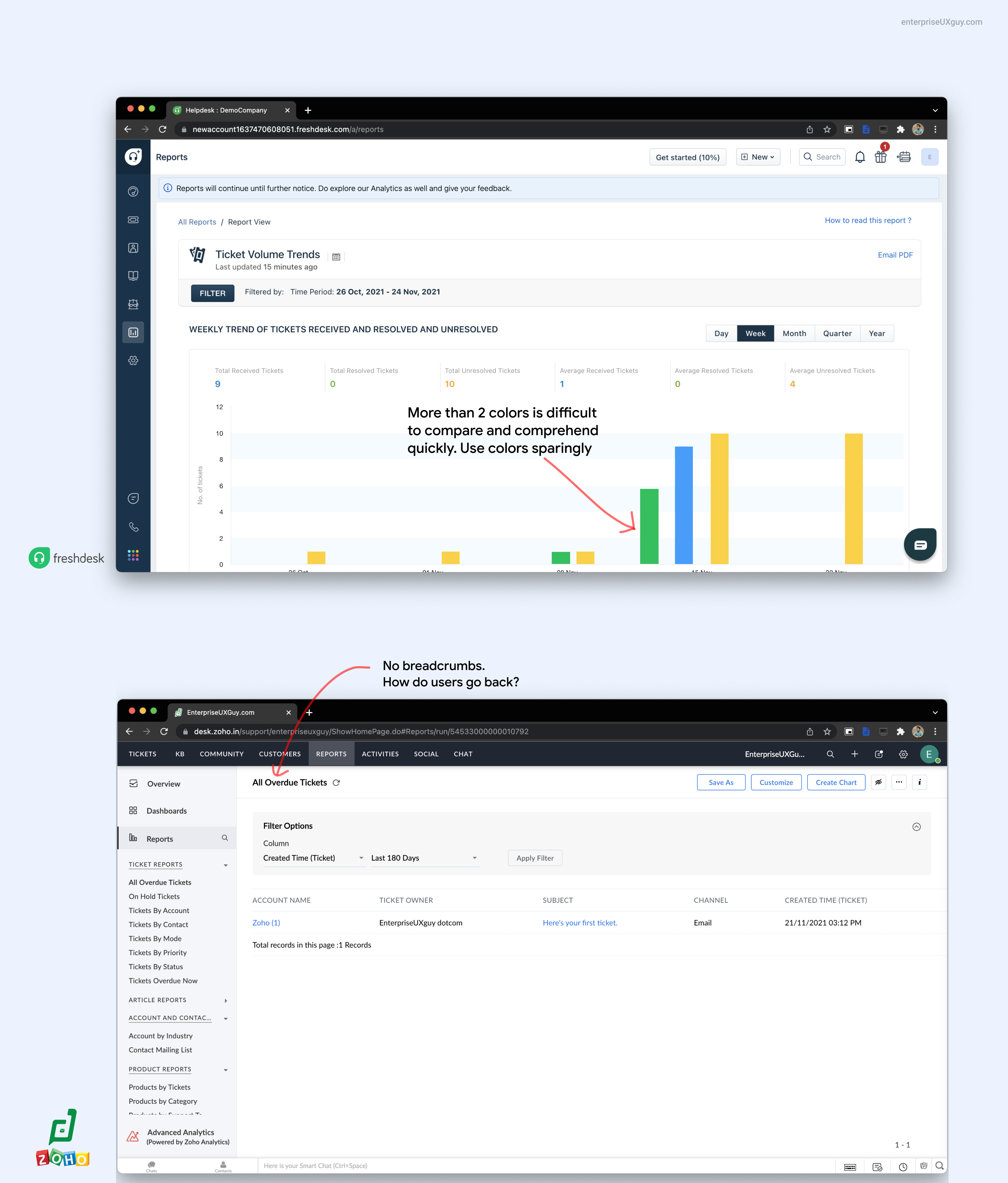
All elements of Gestalt principles when used mindfully, can greatly enhance how well your data can be presented in your software. More about various design principles that you can use in data rich software design in another post.
Do let me know what else you would like me to write about. Until then, singing off, the enterprise UX Guy :)