
Why effective feedback loops in UX matter?
Why effective feedback loops in UX matter?
Faster feedback loops can make the tool part of you and your thought.

Imagine hammering a nail into a wooden plank as shown below.
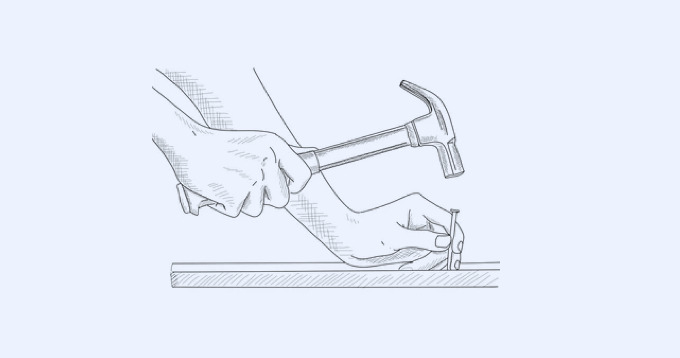
Let’s say you are holding the nail in place with one hand and the other is gripping the hammer. You swing and ‘thud’ - there goes the first hammering. And again and again. After a couple of swings, you are not thinking about the hammer anymore. You are fully focussing on the nail. Your hand could feel the 'thud' of the hammer hitting the nail, the sound, the resistance and the impact of it all. All these 'physical' signals goes back to your arm as tactile feedback. You can instantly recognise a soft hit and a hard one without even looking at the nail directly. Your aim is coordinated not just by the eyes but also by the muscle memory in your hand.
You and the tool's purpose are all aligned up in a way it all feels so natural and fluid.At this point, the hammer almost feels like an extension of your hand.
And that is what 19th century philosopher Heidegger referred to as 'ready-to-hand'. Modern day cognitive psychologists call this the 'continuity of mind'. Media theorist Marshal Mcluhan repeatedly referred to this as how 'every media is an extension of man' .
Alright, its fascinating.. but how is it connected to UX and designing softwares?
The answer is in 'effective feedback loops' in our UI.
The little error messages, the progress bar indicators, the change of the normal cursor to hand cursor when you run your mouse over a clickable component, etc are all valuable feedback loops to the user. Everyone of them has scope for tremendous improvement in all softwares that we use everyday.
Here is an example of colour & motion used ‘meaningfully’ to communicate 'error' even without calling it out as an error.

The sideways nod of the text box is obviously inspired by our human head gesture for ‘No’.

It is such a natural gesture that you can pick it up even if you don’t know the other person’s language. Natural enough for my dog piku to understand that without any training :P. And more importantly it is a relatively lightweight implementation in html5 or react front-end frameworks most apps use today. So it is a win from an implementation point of view too.
Animation doesn’t matter, but contextual and faster feedback matters!
Whether you choose a head nod like motion design for your error message or a big bold error text has smaller impact in the scheme of larger things. But what really matters is dependable, contextual and more importantly faster feedback loops in your UI.
If the user entered something wrong in the middle of a long form, don’t show the error message at the top of the form. We can do better than that. Show it closer to the actual error. That is contextual feedback.
If your error message just says ‘something is wrong’, that is more of a criticism than feedback :). So make it specific and actionable - so that the user can depend on your feedback to fix the issue.
Lastly faster is better. Always. Leverage many of the asynchronous tech available today to display errors instantly when it happens. Don’t wait for the user to press the submit button (unless there is a good ux reason for that). Remember the thud of the hammer and the real time feedback of that. Today’s software can learn a thing or two from that when it comes to faster feedbacks.
For the agile software world…
In agile world, where the mantra is to release fast and fix later, some of these cognitive nuances in UI could get missed. So what do we do? should we abandon agile and jump into deep meaningful UX processes all the time?
Hmm.. that may be a bit idealistic too. Instead the trick lies in identifying the critical user journeys in your product and make them super effortless and frictionless to the user. Do all these for that particular user flow. See how feedback loops can be integrated at the component level in your design system itself. Work with your front end developer to bake that improvement as part of the component code itself (in many ways this is the foundation for creating a design system).
If you are interested to learn more about 'ready to hand' and 'tools as extensions of the self', check this article from MIT press.
When Objects become extensions of you | MIT Press